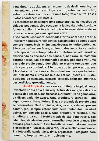
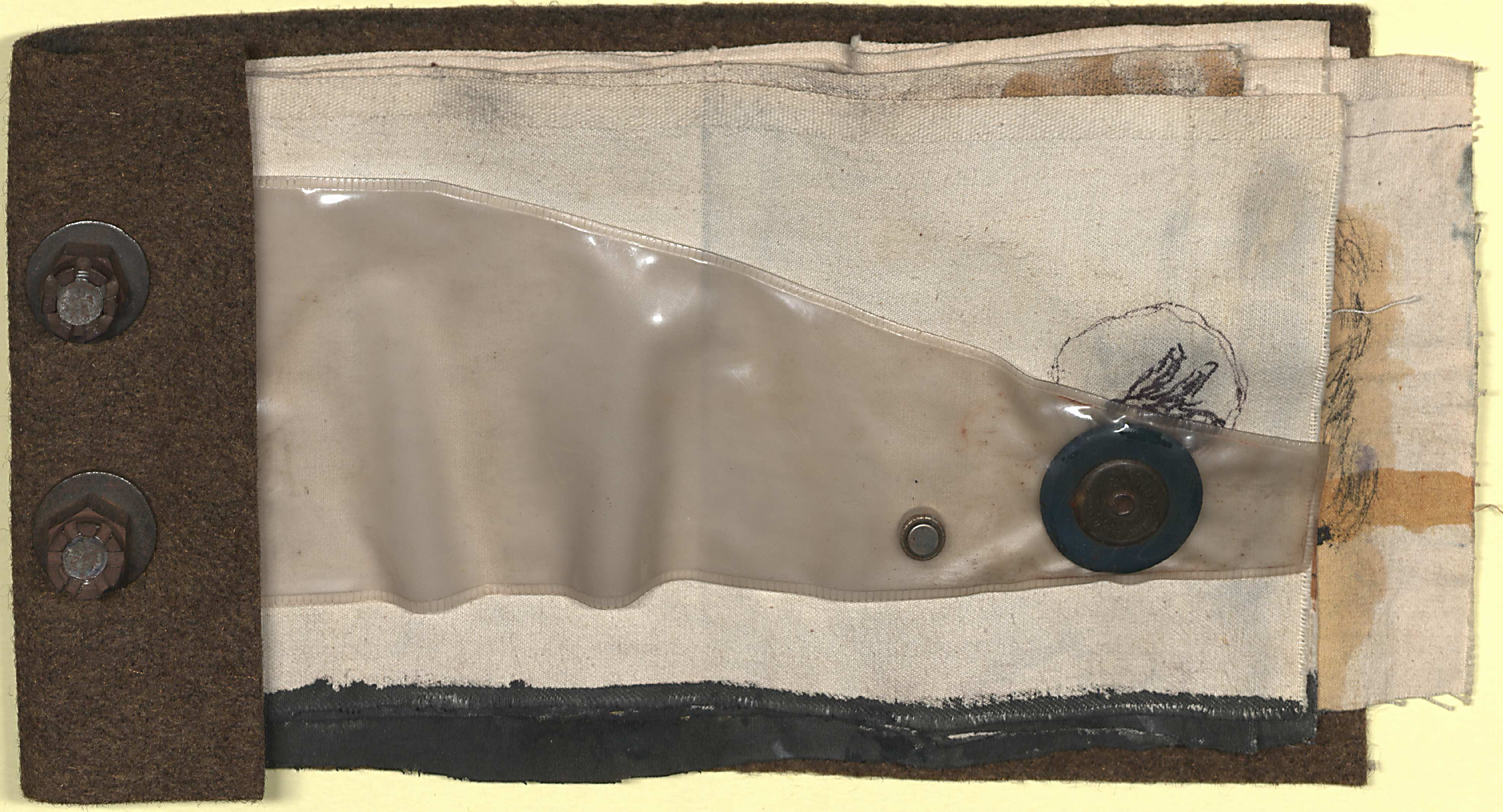
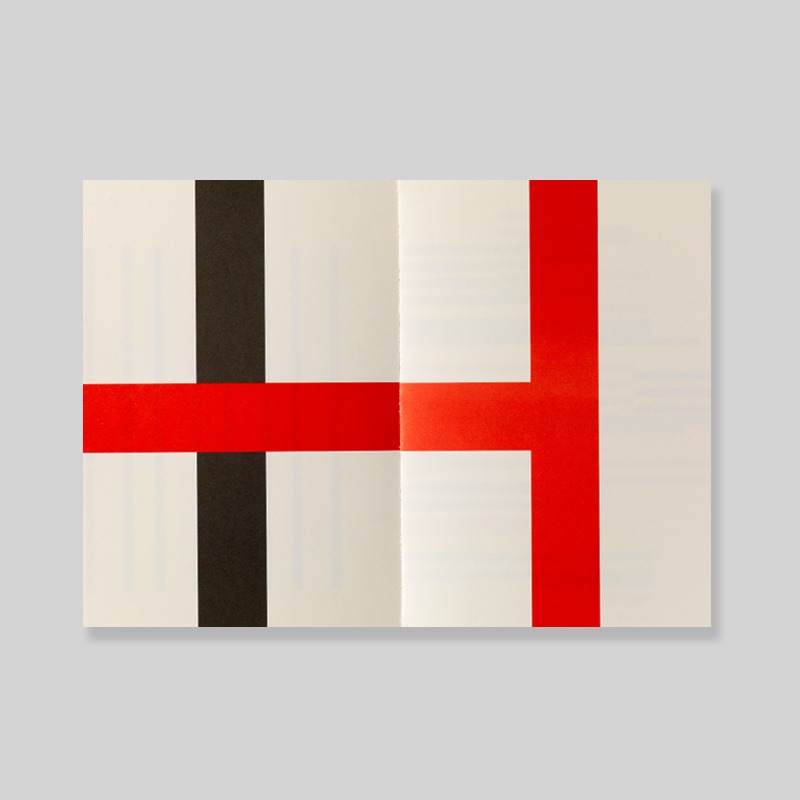
João Castilho
Hotel Tropical
Belo Horizonte, 2013.
21,5 x 32 cm.
80 p.
ISBN: 978-85-911500-2-1
http://www.joaocastilho.net/v2/pt/livros/hotel-tropical/
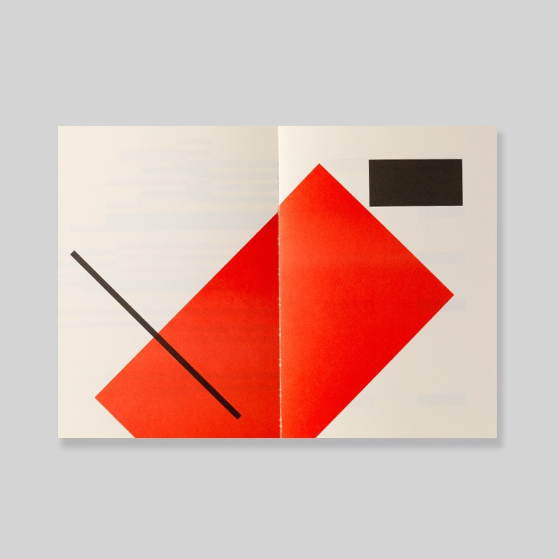
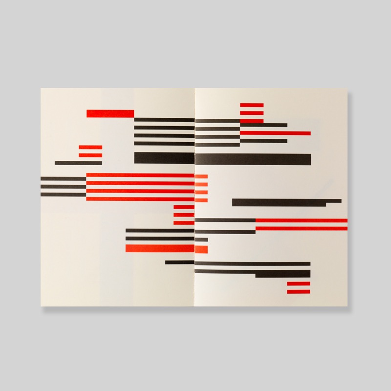
João Castilho
Hotel Tropical
Belo Horizonte, 2013.
21,5 x 32 cm.
80 p.
ISBN: 978-85-911500-2-1
http://www.joaocastilho.net/v2/pt/livros/hotel-tropical/
David Kühne
Vier Ziegel
Düsseldorf, Rhein-Verlag, 2011
9,5 x 14,6 cm.
54 p.
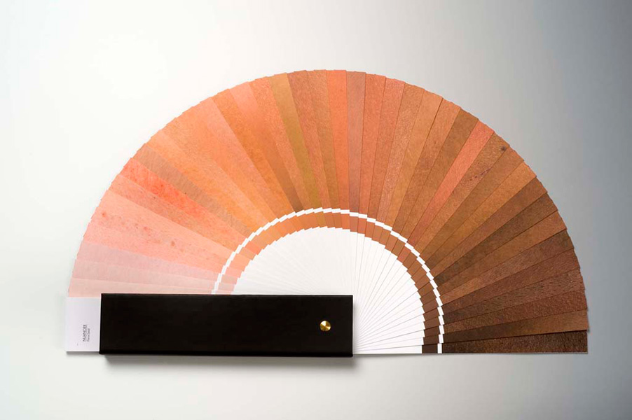
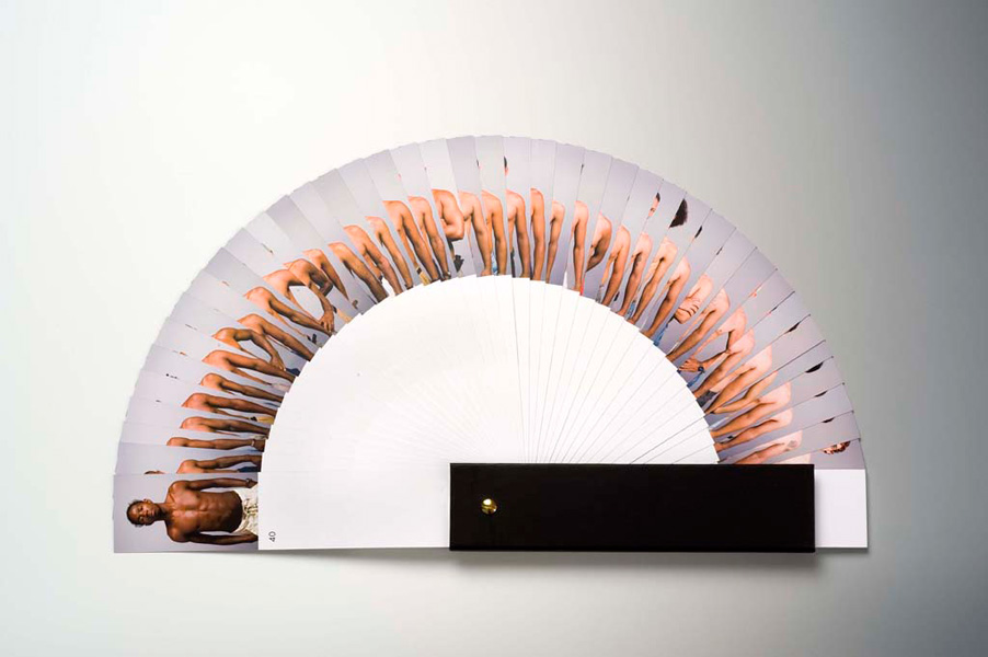
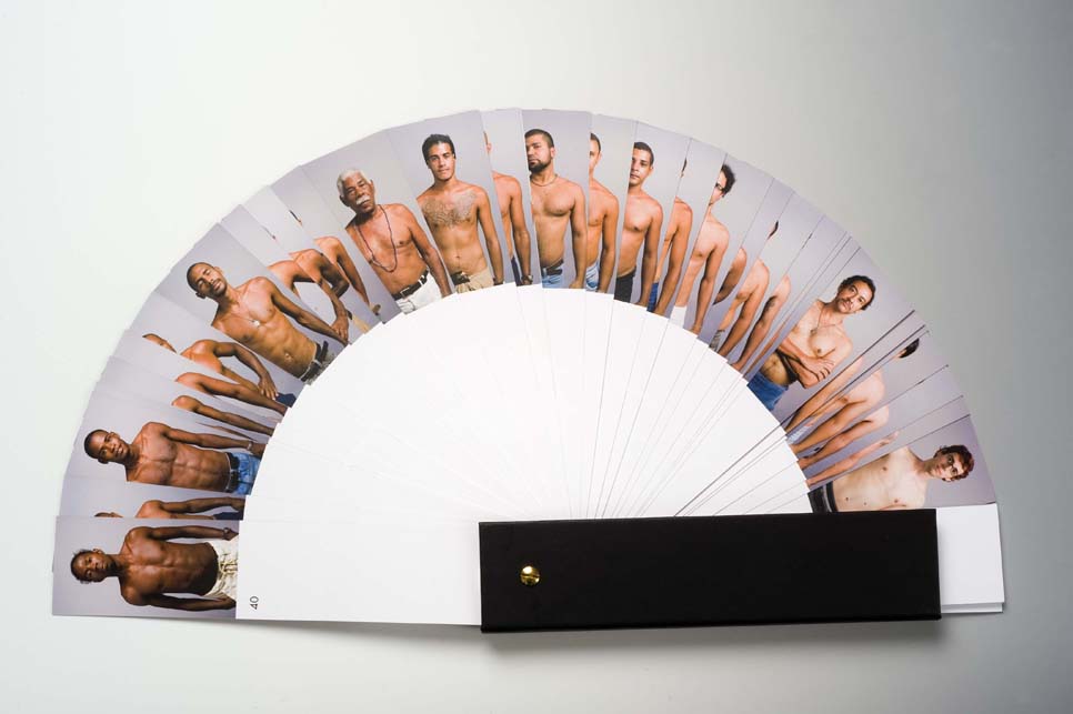
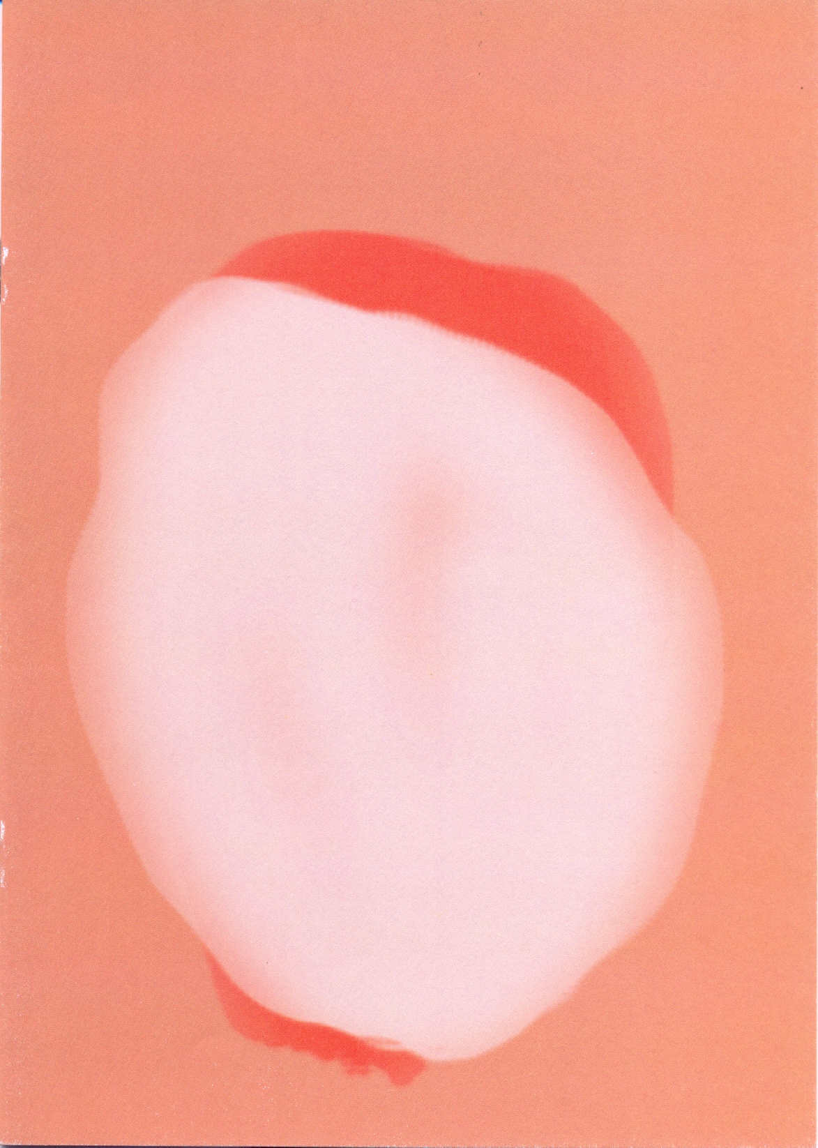
Pierre David
Nuancier
Paris, RVB Books, 2014
28 x 6 x 2,5 cm
1.200 ex.
(édition originale à 250 exemplaires, 2009)
Comercializar a cor da pele dos funcionários do museu
“A cartela de cores faz parte de um conjunto de trabalhos, desenvolvidos há vários anos sobre os critérios de escolha de modelos. Para este projeto, o meu interesse se concentrou na cor da pele. A epiderme das costas de quarenta homens, todos funcionários do museu foram fotografados e colocados juntos em uma cartela de cores.
A fabricante de tintas Sikkens / AkzoNobel desenvolveu as fórmulas químicas para a fabricação industrial das quarenta tonalidades.
A cartela de cores Nuancier foi feita durante uma residência no Museu de Arte Moderna de Salvador da Bahia, em 2008 e 2009.
A primeira apresentação da peça Nuancier aconteceu durante uma exposição individual no MAM Salvador da Bahia, como parte do ano da França no Brasil em 2009”.
Commercialiser la couleur de la peau des employés d’un musée
Nuancier fait partie d’un ensemble de travaux, développés depuis plusieurs années sur les critères de choix des modèles. Pour ce projet, mon intérêt s’est focalisé sur la couleur de la peau. L’épiderme du dos de quarante hommes, tous employés du musée a été photographié et réuni dans un nuancier de couleurs.
Le fabricant de peinture Sikkens/AkzoNobel a mis au point les formules chimiques permettant la fabrication industrielle des quarante teintes.
Nuancier a été réalisée lors d’une résidence au Musée d’Art Moderne de Salvador da Bahia, en 2008 et 2009.
La première présentation de la pièce Nuancier eu lieu lors d’une exposition personnelle au MAM de Salvador da Bahia, dans le cadre de l’année de la France au Brésil 2009.
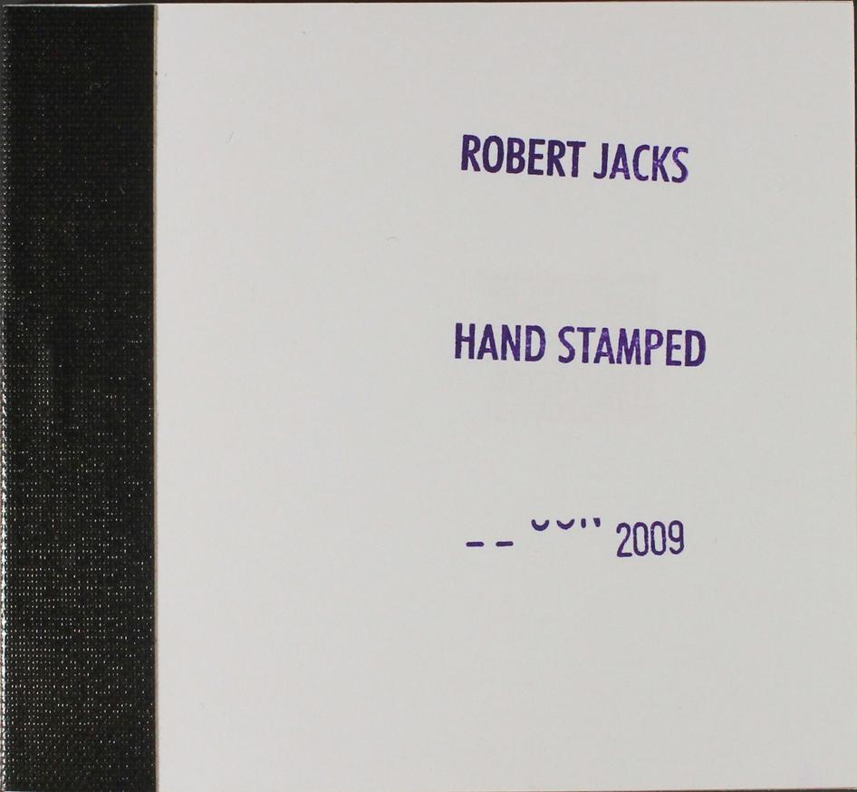
Robert Jacks (Melbourne, Austrália, 1943-2014)
Hand Stamped
R. Jacks, Nova Iorque, 2009
9,5 x 5,5 cm
https://www.printedmatter.org/catalog/45618/
Lenir de Miranda
Livro para Beuys ver
Porto Alegre, 1993
http://www.lenirdemiranda.com/texto_silveira.htm
Sarah Crowner
Format
New York, Primary Information, 2012
86 p.
20 x 25 cm
21 Color and 43 B&W images
1000 ex.
ISBN: 9780985136406
In Format, Sarah Crowner’s first widely distributed artist book, the artist creates a roving collage of source material culled from a diverse range of previously distributed print material: magazines, books, posters, newspapers, postcards, etc. This publication provides a rare insight into the artist’s working practice, demonstrating Crowner’s concerns with visual formulations hinged on historical investigations, particularly in the overlap of art, writing, fashion, and design. Crowner’s graceful positioning of this material gives the reader a spirited visual narrative that unfolds many of our inherited formal mantras of the 20th Century.
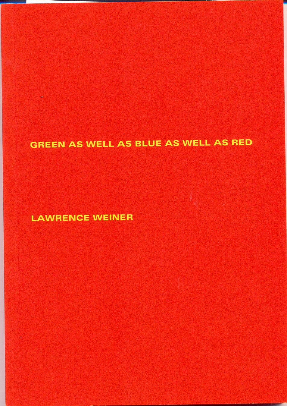
Lawrence Weiner
Green as Well as Blue as Well as Red
Brest : Éditions Zédélé, 2012 [Jack Wendler, Londres, 1972]
17 x 12 cm
100 p.
Brochura
ISBN 978-2-915859-37-9
Publié avec le soutien de / published with the support of:
Centre national des arts plastiques (Cnap)
Lawrence Weiner is one of the pioneers of conceptual art according to which language is the best medium for art. That is why printed matter plays an essential role in his work, from the design of his own catalogues to his proper artist’s books: fifty since 1968.
Lawrence Weiner was one of seven artists included in the well-known publication/exhibition known familiarly as the Xerox Book that was published in New York in 1968 by Seth Siegelaub and John W. (Jack) Wendler. This Xerox Book was one of the auguries of conceptual art. In the same year Siegelaub, with assistance from the Louis Kellner Foundation, published Weiner’s first artist book: STATEMENTS. A few years later, in 1971, Siegelaub’s erstwhile partner Jack Wendler left New York and moved to London. He soon presented his first exhibition, which took the form of a printed card by Lawrence Weiner, and by the beginning of the next year had his own exhibition space. In addition, in 1972, he published Weiner’s ninth artist book: GREEN AS WELL AS BLUE AS WELL AS RED. As Weiner has said: THE BOOK CAME ABOUT BECAUSE OF AN EXHIBITION OF THE WORK AT JACK WENDLER’S GALLERY IN LONDON. I ASKED JACK IF HE WOULD MAKE A BOOK & AND HE SAID YES. HE FOUND A PRINTER & THE BOOK WAS MADE. This simple statement is at one with the kind of book that was published. GREEN AS WELL AS BLUE AS WELL AS RED was, like its eight predecessors, a container for terse verbal information. (It was not until his twelfth book, in 1973, that Weiner introduced photographs into his books.) When asked for two or three lines about the origins of this book, Weiner stated: THERE IS NOTHING TO SAY. A BOOK IS A BOOK FOR ALL THAT. Subsequently he added: THE BOOK IS ABOUT ITS CONTENTS. PERHAPS NOT AT ALL ABOUT THE SHELF IT FINDS ITSELF ON. And finally, given that this is a ‘little red book:’ (PERHAPS IT IS JUST BY CHANCE THAT IT LOOKS LIKE ONE OF MAO’S BOOKS.)
http://www.editions-zedele.net/reprint/green-as-well.html
Bia Bittencourt
Friboi
[São Paulo], 2014
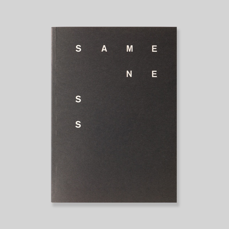
Alex Fuller, Gabe Usadel
Sameness
Chicago, 5×7, 2010
offset, 2 cores
32 p.
brochura
250 ex. numerados
Inspirados pelas teorias da Bauhaus e De Stijl, o objetivo do livro é celebrar a variedade e a interpretação utilizando elementos simples, linhas e cores.
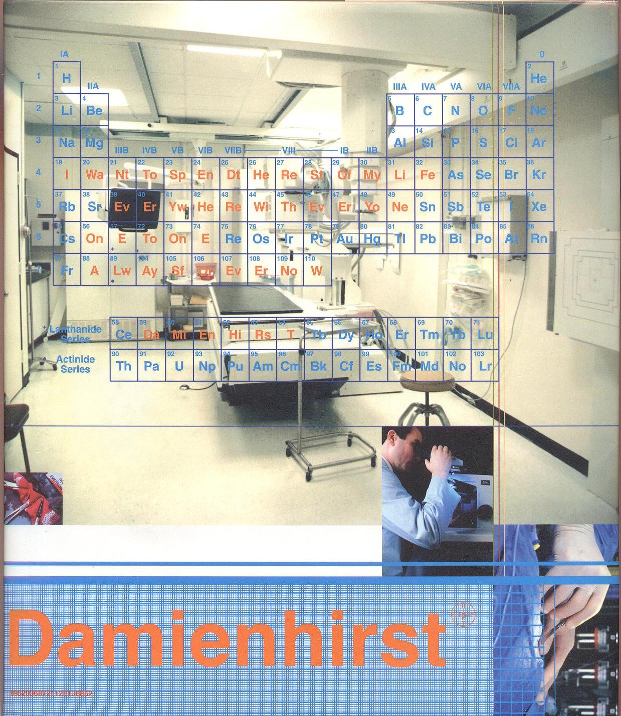
Damien Hirst.
I want to spend the rest of my life everywhere, with everyone, one to one, always, forever, now
Variação do Título: Damienhirst
London: Other Criteria, 2005.
334 p. : il. color.
24 x 21 x 3,5 cm
inclui 1 lâmina com adesivos + 4 transparências com adesivos + 1 poster + 1 postal.
Inclui pop-ups, partes móveis, dobraduras e contém fita marcadora com lupa pendente.
Ensaios de Gordon Burn e Stuart Morgan.
Publicado originalmente em 1997.

A book that took two years to design and redefined the artist’s monograph. The strong graphic treatment was an attempt to enhance the concepts that the artist was trying to put into his work for a modern, visually literate audience. The book contained short pieces of text rather than long academic essays to ensure people actually read it.
Each series of works is treated in a completely different way featuring ‘gimmicks’ such as pop-ups and stickers. These create an understanding that although art deals with fundamental human concepts, it can also be fun and relevant to everyday life.
The cover uses alienating medical stock photos to disconnect the viewer from design. Damien Hirst’s name is shown as though he is some kind of medical product. The title of the book, which comes from one of his sculptures, is represented in a periodic table. The design provided a starting point for much of the visual style for Hirst’s later project Pharmacy restaurant.
The book won a host of international design awards and has appeared in major book exhibitions world-wide. (via https://barnbrook.net/)