Four Basic Kinds of Lines & Colour


PI_PM_LeWitt_Cover-800x800

Sol Lewitt
Four Basic Kinds of Lines & Colour
New York, Printed Matter, 2019
20,3 x 20,3 cm
[34] p.
Offset
ISBN: 9781732098664

This publication is a facsimile edition of Sol LeWitt’s iconic Four Basic Kinds of Lines & Colour. Originally published in 1977, the publication stands as an enduring example of LeWitt’s rigorous process-driven practice, which utilized simple conceptual parameters to generate complex and formally-diverse visual works.

20190624_PI_LeWitt_Spread_03.jpg

Four Basic Kinds of Lines & Colour

Un Autre Livre Rouge

Un_Autre_Livre_Rouge.jpg

Lourdes de Castro & Manuel Zimbro
Un Autre Livre Rouge
Lisboa, Fundação Calouste Gulbenkian, 2015
23,8 x 34,2  cm
240 p.
ISBN: 9789898618795

Un autre livre rouge foi publicado por ocasião da exposição «Todos os livros», de Lourdes Castro, realizada pela Biblioteca de Arte da Fundação Calouste Gulbenkian, na Galeria de exposições temporárias do Museu Calouste Gulbenkian, com curadoria de Paulo Pires do Vale, de 9 de Julho a 26 de Outubro de 2015.

Un_Autre_Livre_Rouge_intUn_Autre_Livre_Rouge_int2

https://www.avidaportuguesa.com/loja/catalogo/livraria/un-autre-livre-rouge-lourdes-castro_4114

Colored People

ColoredPeopleCover

Adrian Piper
Colored People
Londres, Book Works, 1991
21,5 x 28 cm
292 p.
ISBN: 978 1 870699 07 5

“Tickled pink. Scarlet with embarrassment. Purple with anger. Blue. Green with envy. Jaundiced yellow. White with fear. Black depression.” Adrian Piper’s book is a collaboration with sixteen people who were asked to cut out these ‘metaphorical moods’ and record them as photographs which Piper then took responsibility for sorting, depending on her response to the expressions. According to Piper, the book “was intended as a light-hearted conceptual gesture with serious implications”.

Colored People is a project that attempts to deal with two aspects of prejudgement; those made about others and those made about art that is delimited as political as a method of containment of what else it may be about, how richly politics may be defined.

ColoredPeopleSpread617112

https://apps.carleton.edu/campus/gallery/artistsbooks/action/
https://www.bookworks.org.uk/node/26

Nuancier

1feb29f6c037c11be6e2ea108046b225

Pierre David
Nuancier
Paris, RVB Books, 2014
28 x 6 x 2,5 cm
1.200 ex.
(édition originale à 250 exemplaires, 2009)

Comercializar a cor da pele dos funcionários do museu

“A cartela de cores faz parte de um conjunto de trabalhos, desenvolvidos há vários anos sobre os critérios de escolha de modelos. Para este projeto, o meu interesse se concentrou na cor da pele. A epiderme das costas de quarenta homens, todos funcionários do museu foram fotografados e colocados juntos em uma cartela de cores.
A fabricante de tintas Sikkens / AkzoNobel desenvolveu as fórmulas químicas para a fabricação industrial das quarenta tonalidades.
A cartela de cores Nuancier foi feita durante uma residência no Museu de Arte Moderna de Salvador da Bahia, em 2008 e 2009.
A primeira apresentação da peça Nuancier aconteceu durante uma exposição individual no MAM Salvador da Bahia, como parte do ano da França no Brasil em 2009”.

0db398bc970c9b954fc2cf1d30a1d9f2

Commercialiser la couleur de la peau des employés d’un musée

Nuancier fait partie d’un ensemble de travaux, développés depuis plusieurs années sur les critères de choix des modèles. Pour ce projet, mon intérêt s’est focalisé sur la couleur de la peau. L’épiderme du dos de quarante hommes, tous employés du musée a été photographié et réuni dans un nuancier de couleurs.
Le fabricant de peinture Sikkens/AkzoNobel a mis au point les formules chimiques permettant la fabrication industrielle des quarante teintes.
Nuancier a été réalisée lors d’une résidence au Musée d’Art Moderne de Salvador da Bahia, en 2008 et 2009.
La première présentation de la pièce Nuancier eu lieu lors d’une exposition personnelle au MAM de Salvador da Bahia, dans le cadre de l’année de la France au Brésil 2009.

Nuancier

http://www.pierredavid.net

Green as Well as Blue as Well as Red

Green as well as blue as well as red.jpg

Lawrence Weiner
Green as Well as Blue as Well as Red
Brest : Éditions Zédélé, 2012 [Jack Wendler, Londres, 1972]
17 x 12 cm
100 p.
Brochura
ISBN 978-2-915859-37-9

Publié avec le soutien de / published with the support of:
Centre national des arts plastiques (Cnap)

Lawrence Weiner is one of the pioneers of conceptual art according to which language is the best medium for art. That is why printed matter plays an essential role in his work, from the design of his own catalogues to his proper artist’s books: fifty since 1968.

Lawrence Weiner was one of seven artists included in the well-known publication/exhibition known familiarly as the Xerox Book that was published in New York in 1968 by Seth Siegelaub and John W. (Jack) Wendler. This Xerox Book was one of the auguries of conceptual art. In the same year Siegelaub, with assistance from the Louis Kellner Foundation, published Weiner’s first artist book: STATEMENTS. A few years later, in 1971, Siegelaub’s erstwhile partner Jack Wendler left New York and moved to London. He soon presented his first exhibition, which took the form of a printed card by Lawrence Weiner, and by the beginning of the next year had his own exhibition space. In addition, in 1972, he published Weiner’s ninth artist book: GREEN AS WELL AS BLUE AS WELL AS RED. As Weiner has said: THE BOOK CAME ABOUT BECAUSE OF AN EXHIBITION OF THE WORK AT JACK WENDLER’S GALLERY IN LONDON. I ASKED JACK IF HE WOULD MAKE A BOOK & AND HE SAID YES. HE FOUND A PRINTER & THE BOOK WAS MADE. This simple statement is at one with the kind of book that was published. GREEN AS WELL AS BLUE AS WELL AS RED was, like its eight predecessors, a container for terse verbal information. (It was not until his twelfth book, in 1973, that Weiner introduced photographs into his books.) When asked for two or three lines about the origins of this book, Weiner stated: THERE IS NOTHING TO SAY. A BOOK IS A BOOK FOR ALL THAT. Subsequently he added: THE BOOK IS ABOUT ITS CONTENTS. PERHAPS NOT AT ALL ABOUT THE SHELF IT FINDS ITSELF ON. And finally, given that this is a ‘little red book:’ (PERHAPS IT IS JUST BY CHANCE THAT IT LOOKS LIKE ONE OF MAO’S BOOKS.)

http://www.editions-zedele.net/reprint/green-as-well.html

Salvar

Gabinete

gabinete

Lucia Koch  (Porto Alegre, 1966)
Gabinete
Porto Alegre: ed. da autora, 1999
[8] p.
7 x 9.5 cm.
livro sanfonado
edição em fotocópia colorida

A small accordian book of reproduced photographs of colored glass windows throwing a rainbow of light into an empty room. The eight photographs that comprise this book are taken from different angles of the room at varying times of the day, allowing for different light patterns to be projected into the room. The book is enclosed in a small, discrete yellow mailing envelope with label.

Nota: livro acondicionado em envelope pardo, com título impresso em etiqueta colada no envelope. Fotografias da instalação apresentada na Bienal do Mercosul.

Prima Facie

baldessari__PRIMA_FACIE_MARILYN'S_DRESS__BOOK_cover

John Baldessari (National City, EUA, 1931)
Prima Facie: Marilyn’s Dress. A Poem (in Four Parts).
Cologne: Walther König, 2006.
13 x 17 cm.
44 p.
ISBN : 3865600883

Mais do que qualquer outro artista de sua geração, John Baldessari explora a relação entre a ler e o ver, entre a linguagem e a imagem, culminando em sua série mais recente, Prima Facie. Em seu livro de artista, ele justapõe 16 cores e nomes dados por empresas americanas a suas cores corporativas: calma”, “céu” ou “deslizamento de lama”. A percepção afetiva dos respectivos valores sonoros e conteúdos linguísticos cria uma rede quase lírica de correspondências, continuando poeticamente a arte conceitual da década de 1970.

“A special edition with a print, signed and numbered, with the book in a box the is being published: 45 copies +5 a.p.” —

baldessari_IMG_0988

More than any other artist of his generation, John Baldessari explores the relationship between reading and seeing, between language and image, culminating in his most recent work series Prima Facie. In his new artist’s book he juxtaposes 16 colour plates which American companies attribute to their corporate colors: “calm”, “heaven” or “mudslide”. The affective perception of the respective sound values and linguistic contents creates an almost lyrical web of correspondences, poetically continuing the strict concept art of the 1970s.

baldessari__PRIMA_FACIE_MARILYN'S_DRESS__BOOK_05

SaveSave

La Carte de Tendre

carte-de-tendre_Fcarte-de-tendre_B

Bernard Villers
La Carte de Tendre
Rennes : Incertain Sens / Châteaugiron : FRAC Bretagne, 2009
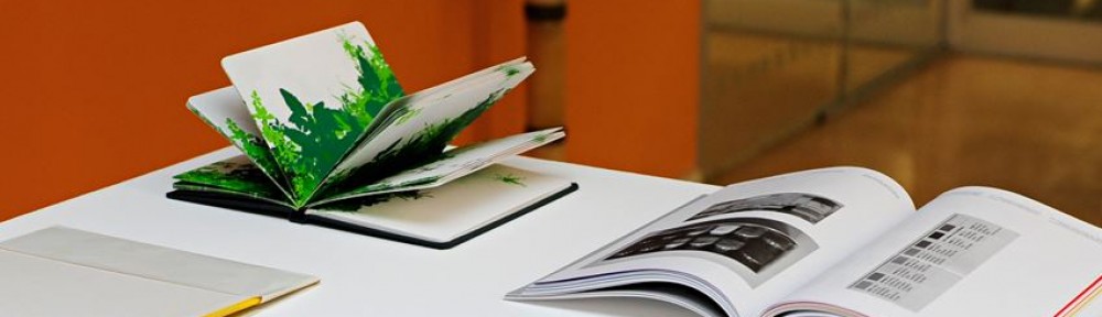
Cartaz, 6 dobras
impressão em duas cores
28,5 x 12,2 cm (formato fechado), 57 x 73,2 cm (formato aberto)
ISBN. 2-914291-32-9

carte-de-tendre_2

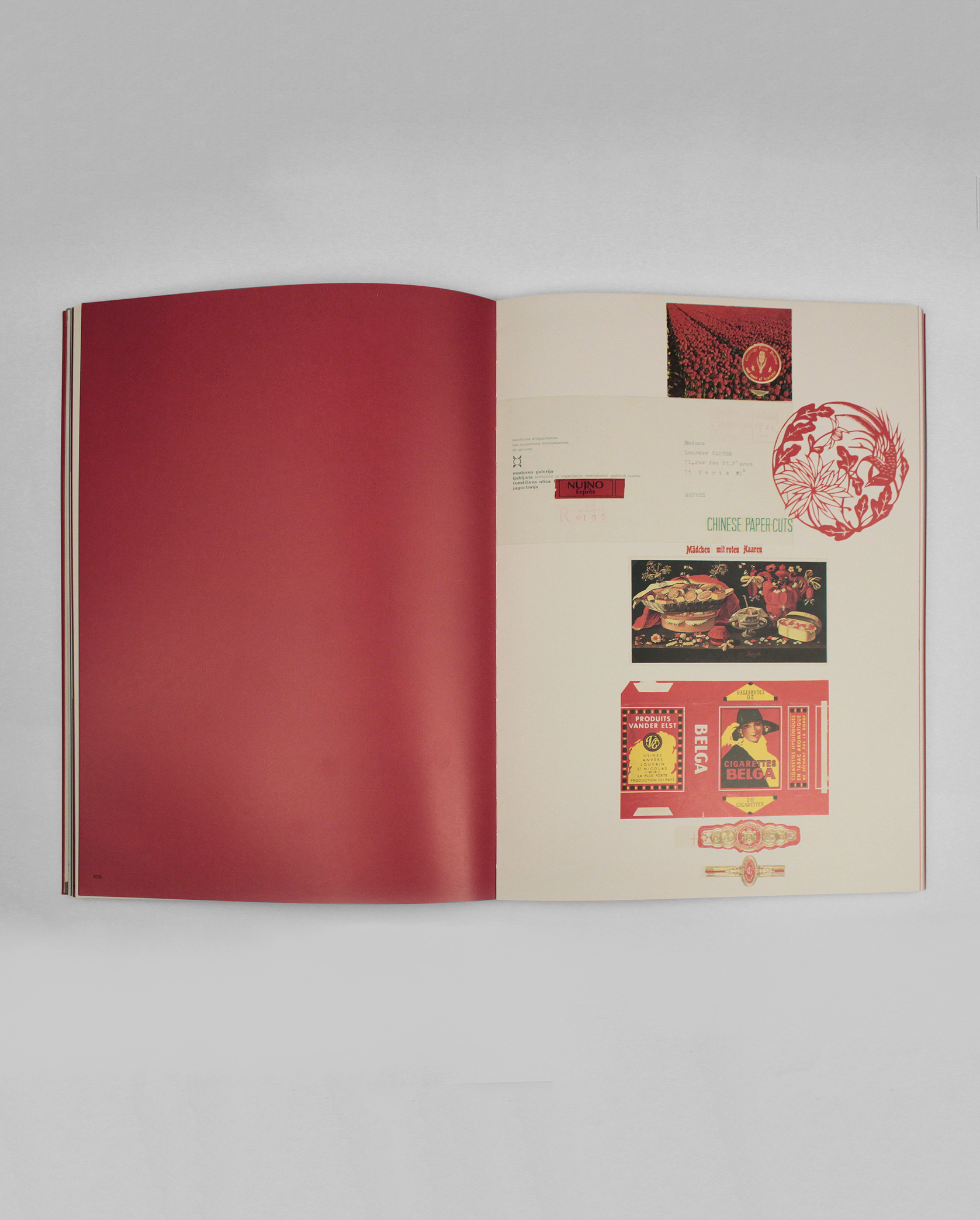
Este livro de Bernard Villers tem o seu sentido definido pela dobra: O Mapa da Ternura. O diagrama que explica a sequência de dobras foi impresso no verso do mapa dobrado, e uma parte da edição deixa por conta de seus futuros leitores para dar-lhe a sua forma própria. “Tendre” ou Ternura é o nome de um país imaginado no século XVII; Mapa da Ternura é, portanto, uma representação topográfica e alegórica da vida amorosa, cuja primeira versão tem mais de 300 anos. A última, a de Bernard Villers, talvez seja uma nova interpretação de Et in Arcadia ego; vemos se cruzarem nele duas séries de pesquisas desenvolvidas pelo artista por mais de trinta anos, a construção de uma poética da dobra e o reencontro do espírito de seus primeiros livros de artista que prolongavam a prática da pintura no espaço do livro. O mapa propriamente dito imaginado por Bernard Villers é de fato marcado por um valor poético forte, mas puramente pictórico. Este livro pode ser lido como uma nova topografia da felicidade na pintura.

Ce livre de Bernard Villers affirme son sens par la forme même du pli : La Carte de Tendre. Le schéma qui explique l’ordre des plis est d’ailleurs imprimé à la dernière page de la carte pliée, et une partie du tirage laisse à ses futurs lecteurs le soin de lui conférer sa forme propre. « Tendre » est le nom d’un pays imaginé au XVIIe siècle ; la Carte de Tendre est donc une représentation topographique et allégorique de la vie amoureuse, dont la première version date d’il y a plus de 300 ans. La dernière, celle de Bernard Villers, est peut-être une nouvelle interprétation d’Et in Arcadia ego; on voit se croiser en elle deux séries de recherche développées par l’artiste depuis plus de trente ans, l’une construisant une poétique du pli, l’autre retrouvant l’esprit de ses premiers livres d’artiste qui prolongeaient la pratique picturale dans l’espace du livre. La carte proprement dite imaginée par Bernard Villers est en effet marquée d’une valeur poétique forte, mais purement picturale. Ce livre peut donc être lu comme une nouvelle topographie du bonheur en peinture.

http://bernardvillers.be/expositions/2009/la-carte-de-tendre/