Satisfaction

Specific Object

Allan Kaprow  (Atlantic City, EUA, 1927-2006)
Satisfaction
New York, M. L. D’Arc Gallery, 1976

Text and design by Allan Kaprow
Photographs by Bee Ottinger
16 p.,
27.9 x 21.5 cm.

kaprow Satisfaction_Página_03
kaprow Satisfaction_Página_05

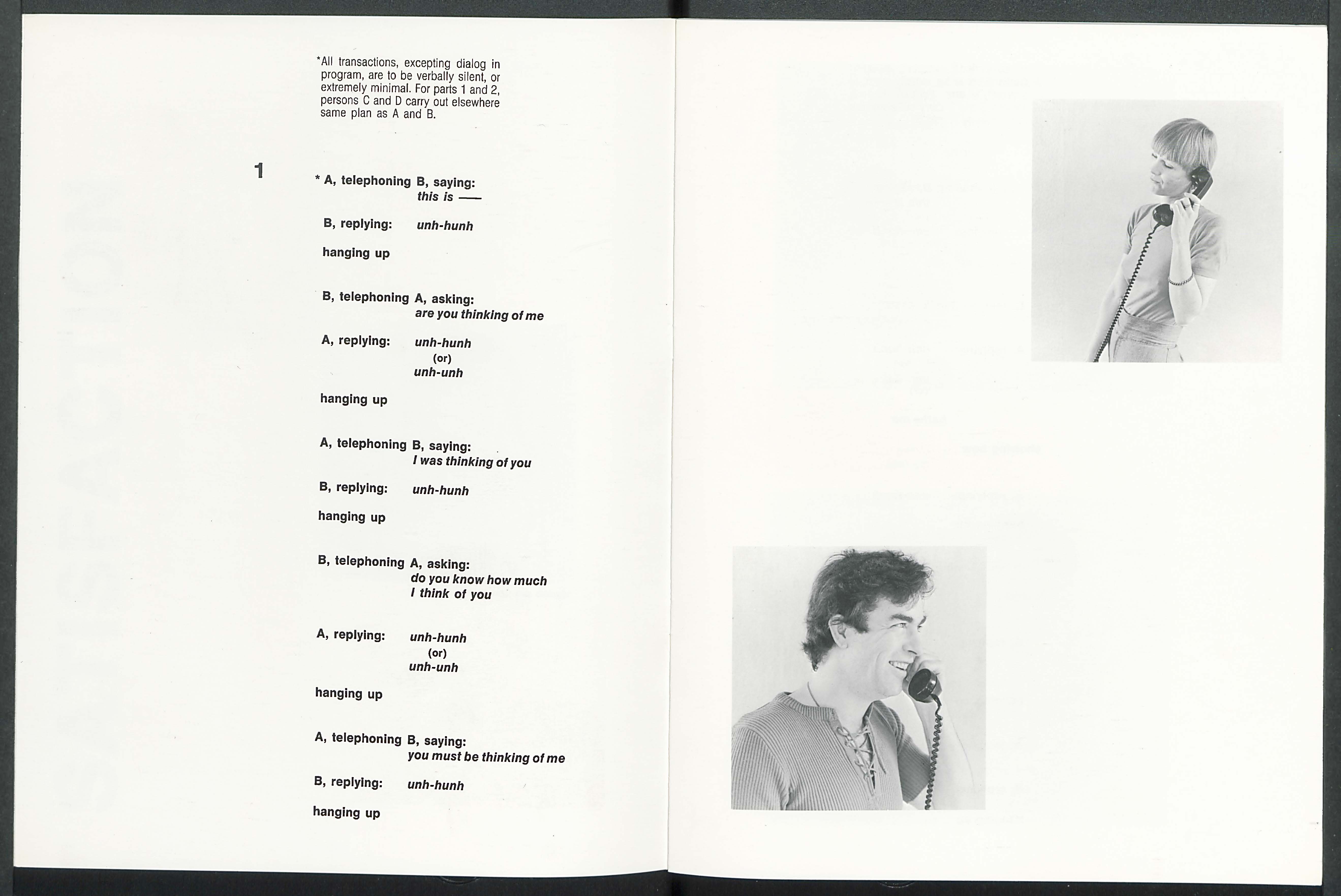
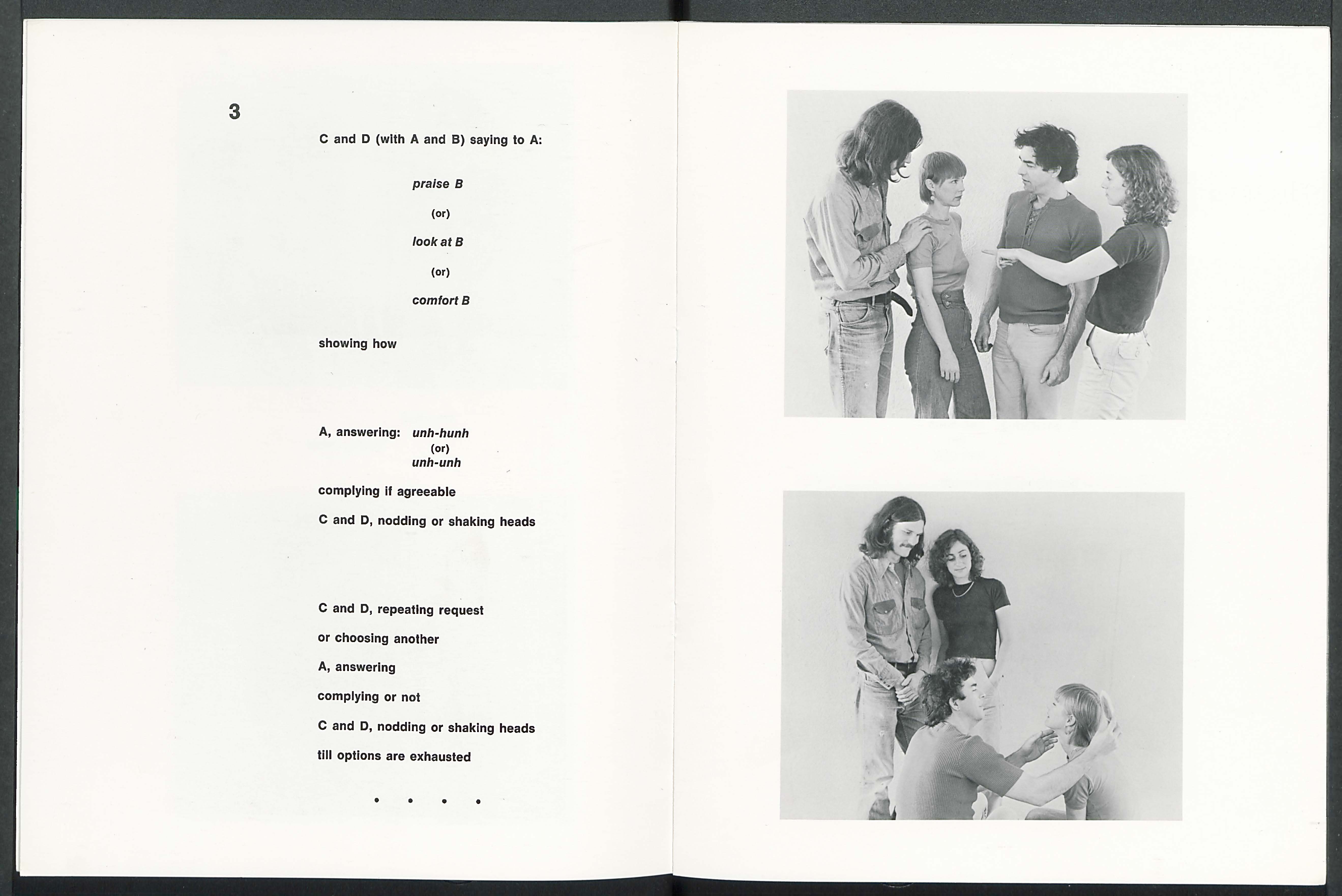
Artist’s book by Allan Kaprow documenting his happening Satisfaction, which took place in April 1976. Book comprised of images and texts by Kaprow that outline the happening. “Ordinarily, we want and manage to get a certain amount of attention from the world all of our lives. The kind, manner and quantity may change, but in any case it’s attention. It follows that others want attention from us. A sort of acknowledgement-economics is involved, a trade-off, usually with a profit motive. We would like (unconsciously of course) to get more that we give…”

Four actors–two male, two female–perform short scripts by Kaprow in which they must seek, give, or deny attention to one another. Carried out by four groups of four in 1976 in New York, this book documents one group’s performance of Satisfaction with black and white photographs and reproductions of the scripts. In a short essay at the back, Kaprow discusses the range of complex social and emotional interactions this deceptively simple exercise can (and is meant to) bring out in its participants.

Salvar

Untitled (Comic Book)

174_dsc0454

Frédérique Rusch (France, 1977)

Untitled (Comic Book)
[Strasbourg, France], Éditions du Livre, 2013
16 p.
17 x 26 cm
4 colours risograph print
on 115g Munken Print White
Printed by Hato Press
First edition of 100
Second edition of 125

“A Minimalist Comic Book That Stares Straight Into Piet Mondrian’s Soul: Frédérique Rusch transforms Mondrian’s two-dimentional primary-colored grid into a three-dimentional space, with a subtle Charles Burns reference thrown in for good measure.”
Mark Wilson on www.fastcodesign.com

“Frédérique Rusch pays homage to the grid from Charles Burns’ Black Hole and creates a minimalist visual aesthetic for graphic novel fans. The artist colors in traditional story board layouts and replaces common cartoon imagery with bare panels that each transform into individual spatial entities.”
Jana Pijak on www.trendhunter.com

174_dsc0462 174_dsc0463 174_dsc0464 174_dsc0457 174_dsc0460 174_dsc0467 174_dsc0468

http://www.editionsdulivre.com/untitled-comic-book

Salvar

100 Scenes: a graphic novel

100 Scenes (front cover)

Tim Gaze
100 scenes: a graphic novel
Kent Town, Austrália: Asemic editions, 2011.
[109] p.

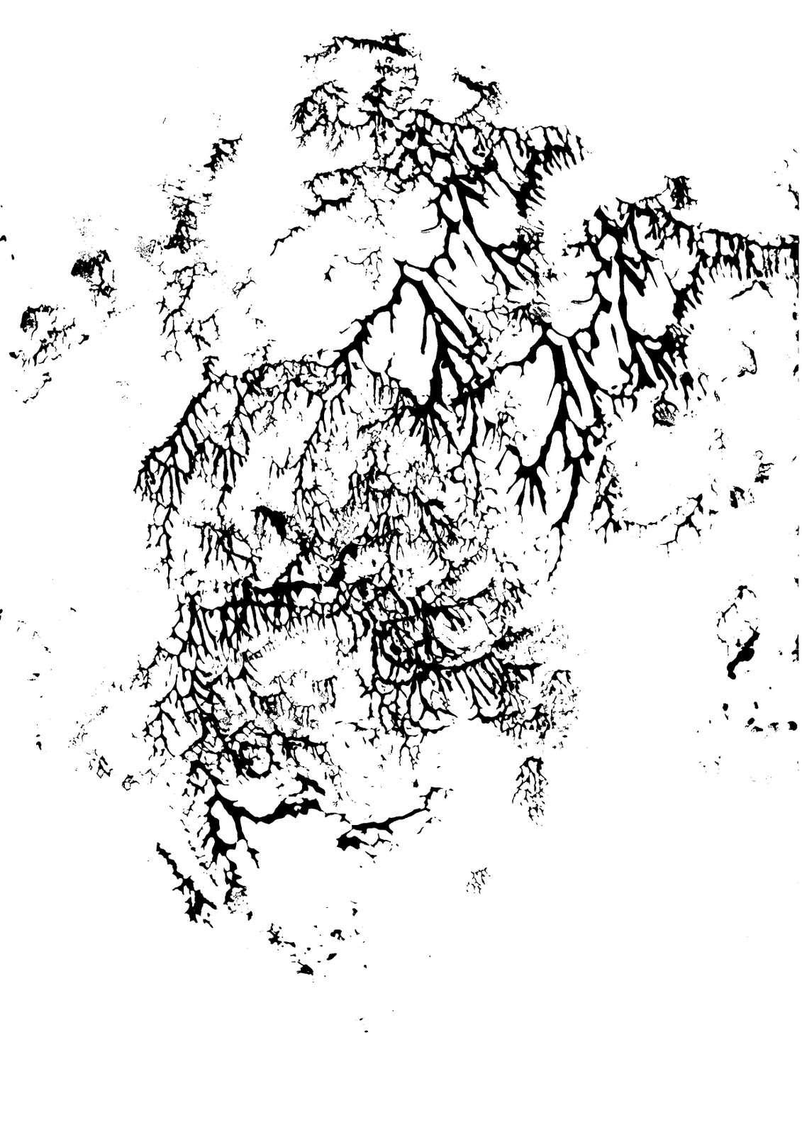
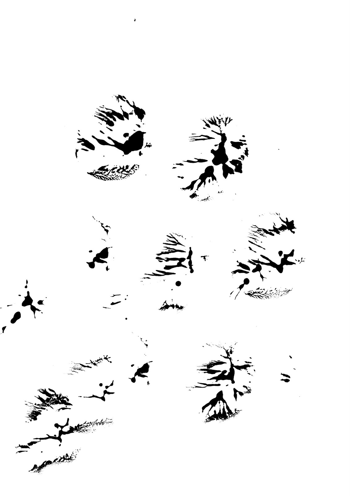
The images are raw scans of original pages made by me, using cheap acrylic paint on sheets of ordinary office paper. The pages were made over a period of 4 or 5 years. It took a few weeks to select which hundred to assemble into this book, and a few more weeks to decide on which order to put the pages. One page has a conspicuous black line on the right hand side, which I left there.

Most of the marks were made using a technique known as decalcomania. You spread ink or paint on a surface, then print off that surface, which results in chaotic, organic, blotty shapes. The Surrealist artist Oscar Domínguez invented this technique in 1936. Max Ernst made several paintings which used decalcomania along with other techniques. One example is Landscape with Lake and Chimeras (ca. 1940).

Uma resenha mais detalhada do livro pode ser encontrada aqui: http://galatearesurrection16.blogspot.com.br/2011/03/100-scenes-by-tim-gaze.html

The abstract graphic novel 100 Scenes by Tim Gaze is now available as a paperback book, printed on demand, at Digital Print Australia.

The e-book version of 100 Scenes, published by Transgressor, is available from the distributor XinXii.

You can watch a slideshow of every page in the book.

Eileen Tabios’ review is here.

(via http://asemic-editions.blogspot.com)