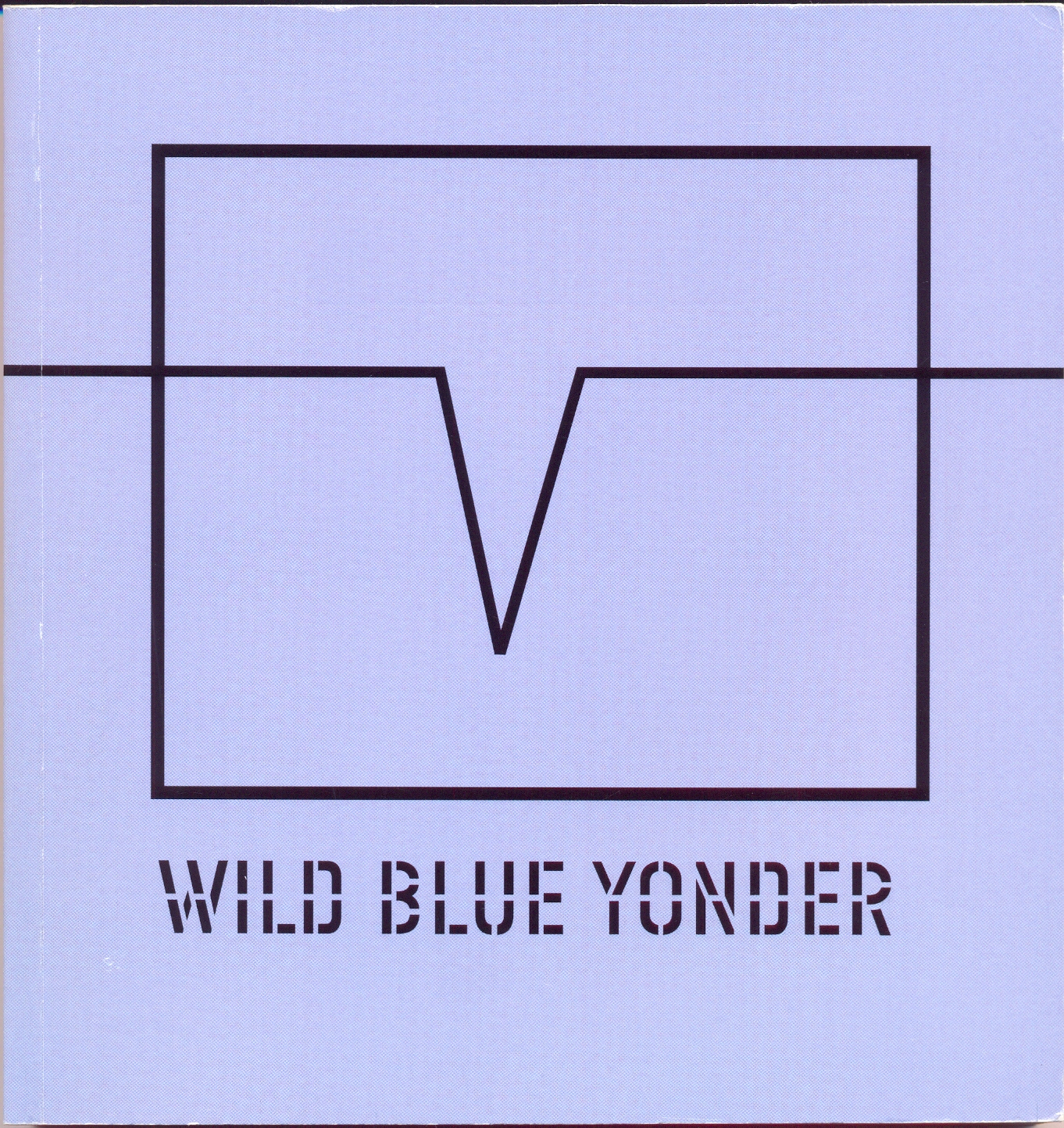
Wild Blue Yonder
Lawrence Weiner
Moved Pictures / Printed Matter
Nova York, EUA
2002
Inglês
17,4 x 18,2
1000 ex.
Offset
Nota: Baseado no filme Wild Blue Yonder
Wild Blue Yonder
Lawrence Weiner
Moved Pictures / Printed Matter
Nova York, EUA
2002
Inglês
17,4 x 18,2
1000 ex.
Offset
Nota: Baseado no filme Wild Blue Yonder
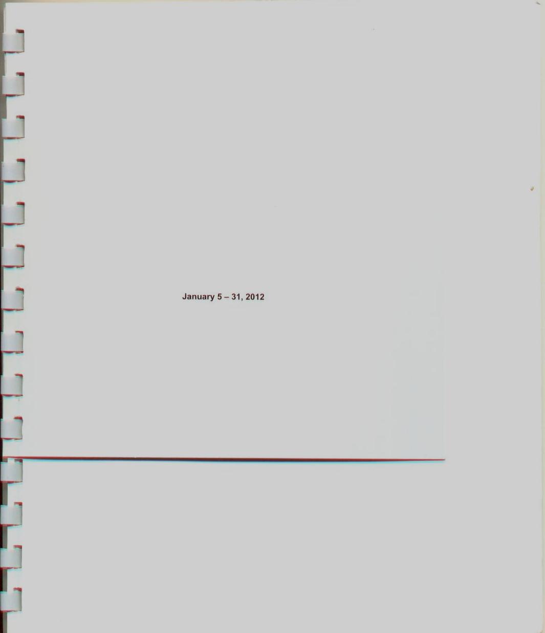
Michalis Pichler
January 5-31, 2012
Berlin: Greatest hits, 2012.
[12 p.]
21 x 17,5 cm.
400 exemplares.
xerografia
In 1969 Seth Siegelaub organized an exhibition (and publication) with the title January 5 – 31, 1969, one of the first exhibition projects of conceptual art, with the participation of Robert Barry, Douglas Huebler, Joseph Kosuth and Lawrence Weiner.
Back then there was already talking about a so-called “linguistic turn” that had been taken place in the visual arts and in consequence led to idea art. Nevertheless one could hardly deny, that those artistic/poetic strategies are being reused and radicalised around the turn of the millennium and recently.
January 5 – 31, 2012 is gathering some of these positions, presenting Craig Dworkin, Kenneth Goldsmith Jonathan Monk and Michalis Pichler.
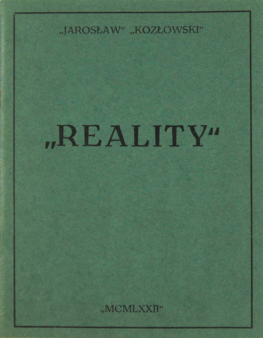
Jarosław Kozłowski
Reality, (1972) 3rd Printing 2014.
Matt’s Gallery / X Marks the Bökship
“REALITY “ is based on Immanuel Kant’s Critique of Pure Reason. It is a precise copy of the third subchapter of The Transcendental Power of Pure Judgement (Analysis of Principles) from Doctrine of Elements (part II, section 1). “REALITY” means reality.
. , : ; – ( ) / / ” “ ! ? … – or punctuation – is something which escapes conformation with metalinguistic reality and which does not constitute either its representation nor its description (in written language).
Although we commonly refer to punctuation marks, these notations have no meaning external to themselves. They do not have any models in meatalinguistic reality and themselves do not model any elements of that reality. They have no designates, while, simultaneously, not being void, they are therefore neutral vis-à-vis metalinguistic reality.
. , : ; – ( ) / / ” “ ! ? … create reality which is e q u i v a l e n t to metalinguistic reality. In a sense they are the only “REALITY” reality of ‘Jarosław Kozłowski ‘.
Con-Text, Bunkier Sztuki, 2009
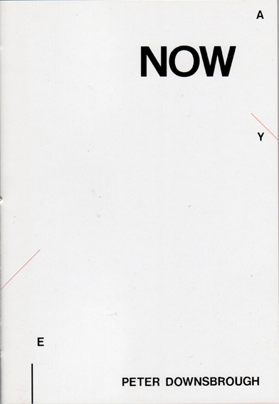
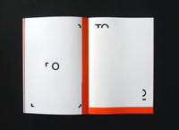
Peter Downsbrough
NOW
Rennes, Incertain Sens, 2010
dos carré cousu collé
offset noir & blanc et une couleur
[32p.]
21 x 14,5 cm
1000 ex.
2-914291-39-6
NOW was first published as part of my exhibition at the PWSSP (today the Władysław Strzemiński Academy of Fine Arts and Design) in Łódż, Poland, from 6 – 22 June 1986. The book was printed by silkscreen at the school’s print department, as access to offset was not possible at the time. The school censor allowed us to print 49 copies “for in-school use” with the obligatory inclusion of the colophon on page 3:
Państwowa Wyższa Szkoła Sztuk Plastycznych w Łodzi
Pracownia sitodruku – Maciej Nowakowski
Nakład 49 egzemplarzy
DO UŻYTKU WEWNĘTRZNEGO
O Peter Downsbrough
1986
State School of Fine Arts in Łodż
Silkscreen studio – Maciej Nowakowski
Printed in 49 copies
FOR IN-HOUSE USE
By Peter Downsbrough
1986
Due to technical conditions only 3 copies were useable. It is now being republished in offset by Editions Incertain Sens, 2010, using the original mechanicals.
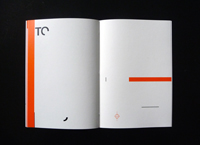
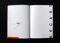
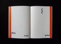
Peter Downsbrough
GLOSSARY
English – Polish
NOW : TERAZ
THIS : TO
TO : DO
RECAST : PRZETAPIAĆ
OR : ALBO
Polish – English
OBRAZ : IMAGE
I : AND
W : WITH
NOWY [NOW/Y] : NEW
A : AND
TO : THIS
DO : TO
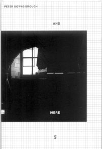
Peter Downsbrough
And Here, as
Rennes, Incertain Sens, 2005
brochura
offset preto & branco
[72] p.
16,5 x 11 cm
1.500 ex.
isbn 2-914291-13-2
Peut-être est-ce un livre sur l’atelier de l’artiste, celui que montre la photo de la couverture, quelque peu énigmatique. Toujours est-il que les pages qui suivent parlent (AS/IF, SET/ABOUT, etc.) d’un lieu (IN/OUT, HERE/OR/THERE, etc.) et de la façon dont on en fait l’expérience (LIMITES/TIME, AGAIN/BUT, etc.), car ce livre déploie un langage plastique ; langage où d’ailleurs le lecteur reconnaît la signature de Peter Downsbrough. Des mots dont la forme se transforme (recto/verso, coupure/séparation, slash sécant, etc.) sont associés à quelques formes graphiques (carré, grille, aplat) pour former une structure dont les configurations sont comme autant d’énoncés à lire. Seulement, leur sens se dérobe à toute détermination concrète. Mais, insaisissable, il entraîne le lecteur toujours loin au-delà de ce qu’il montre. D’où le paradoxe : autant l’hypothèse de l’atelier de l’artiste reste entièrement incertaine, autant l’énigme se dissipe à la lecture du livre, car si est énigmatique ce dont on sait trop peu, nous n’en savons maintenant que trop – une fois le livre refermé – pour pouvoir le dire.
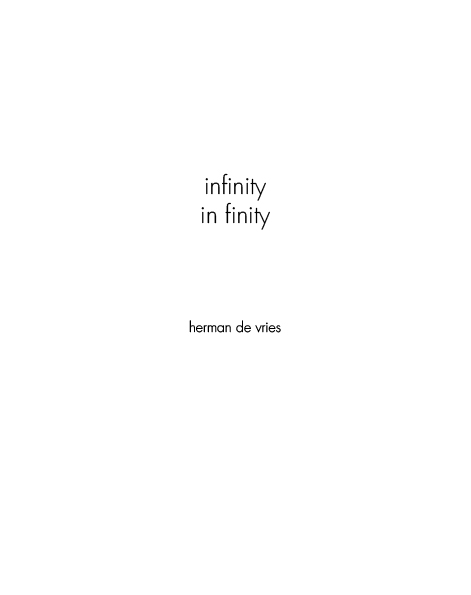
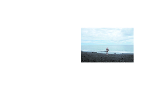
herman de vries
Infinity in Finity
Rennes, Incertain Sens, 2013
dos carré cousu collé
offset couleur et noir & blanc
[24p.]
21 x 16,6 cm.
ISBN 978-2-914291-60-6
Ce livre s’ouvre sur une photographie montrant l’artiste nu, faisant face à l’étendue de la mer. S’y succède un texte, composé de ces trois mots : infinity in finity, répétés à l’infini. Où est donc l’infini ainsi évoqué ? dans l’horizon de la mer ? dans les pages du livre ? dans le texte lu ou dans l’expérience de l’art ?
Le texte décliné sur l’ensemble des pages existe sous une forme orale. Déclamé à trois voix par Cees de Boer, herman de vries et Katharina Winterhalter.
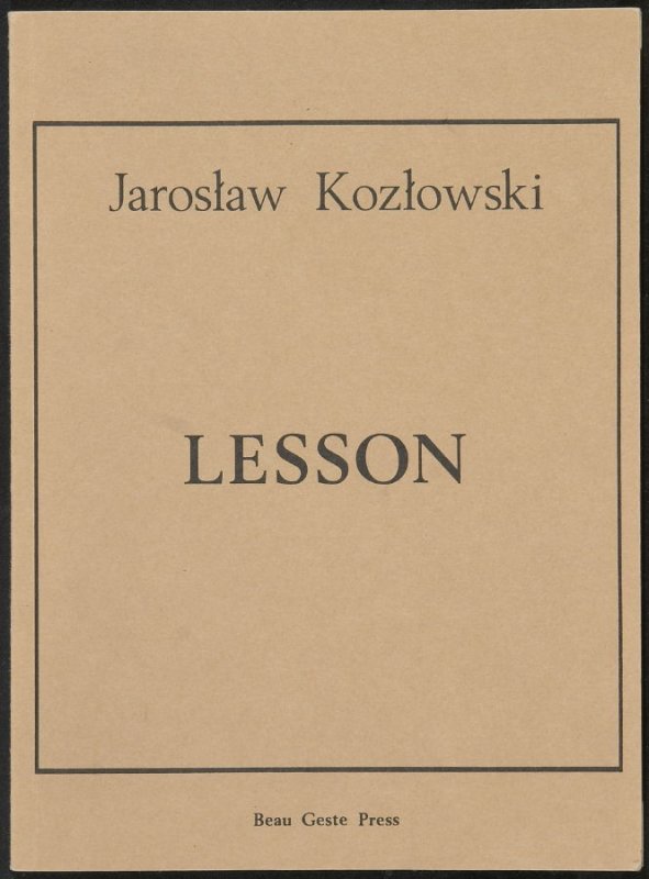
Jaroslav Kozlowski
Lesson
Devon: Beau Geste Press, 1975
21.2 x 15.9 cm
English lesson written in Poland in 1972, published in England 1975
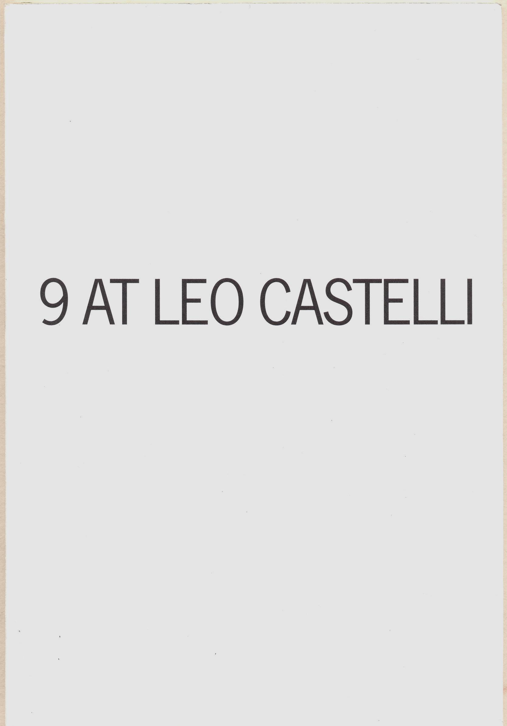
Mario García Torres
9 at Leo Castelli
editor e curador: Jens Hoffmann
Fotografia: Mario Garcia Torres
edição de texto: Lindsey Westbrook
design: Stripe/Jon Sueda.
San Juan, Porto Rico: Instituto de Cultura Puertorriqueña, 2009.
46 p.
20,5 x 14 x 0,5 cm.
Impressão em offset
750 exemplares.
Esta publicação faz parte de uma série de livros de artista publicados para a 2da Trienal Poli/Gráfica de San Juan: América Látina y el Caribe, 18 de abril – 28 de junho, 2009, organizada pelo Instituto de Cultura Puertorriqueña.
Em 1968 aconteceu a exposição “9 at Leo Castelli,” organizada pelo artista Robert Morris a partir de suas ideias sobre “Anti-Form,” um ensaio publicado na revista Artforum naquele ano. As obras escolhidas por Morris abordavam o material, o processo e o próprio local. A mostra deveria apresentar obras de Giovanni Anselmo, William Bollinger, Eva Hesse, Stephen Kaltenbach, Bruce Nauman, Alan Saret, Richard Serra, Keith Sonnier e Gilberto Zorio. (http://artforum.com/)
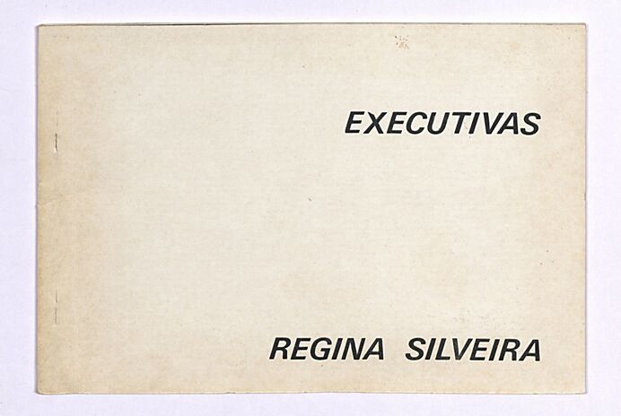
Regina Silveira (Regina Scalzilli Silveira) (Porto Alegre /RS, 1939)
Executivas
São Paulo, ed. do autor, 1977
16 x 10,5
offset
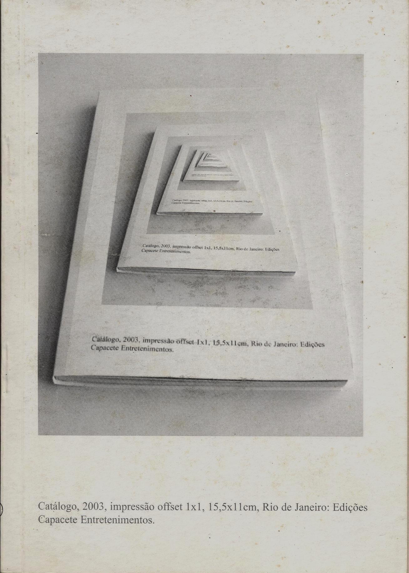
Carla Zaccagnini
Catálogo
Design da capa: Helmut Batista.
Texto: Camila Rocha
Rio de Janeiro: Capacete Entretenimentos, 2003.
64 p.: il. p&b;
15,5 x 11 x 0,4 cm.
Impressão em offset
tiragem: 2.000 exemplares.
Inclui bibliografias.
Brochura com grampos.